Difference between revisions of "Custom Hero Selection Screen"
m (moved Custom UI to Custom Hero Selection Screen) |
|
(No difference)
| |
Revision as of 22:29, 11 May 2011
Custom UIs are often used for things like Hero Selections, Stores, etc.
Available Assets
It is imperative to select a custom Asset for your dialogs if you want to make things look minimally customized. Here is a list of some assets available for you to choose:
- ui_help_frame_tips_checkbox_normalpressed.dds
- ui_help_frame_tips_checkbox_normaloverpressedover.dds
- ui_research_frame_outer.dds
- ui_planetpanel_techportraitframe.dds
- ui_planetpanel_contactportraitframe.dds
- border-protoss-transportslot-filed.dds
- Search for "battle_frame": the 4 first results are good.
Design example + Trigger Reference
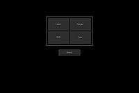
The following trigger will give you this result:

It has been taken from the map "Swarmed Heroes", which is Open Source. Take note that it is fully commented.
Map Init
   Events
       Game - Map initialization
   Local Variables
   Conditions
   Actions
       UI - Hide World for (All players)
       UI - Hide game UI for (All players)
 -------
"SELECT" BUTTON
 -------
       Dialog - Create a Modal dialog of size (275, 75) at (0, 80) relative to Center of screen
       Dialog - Show (Last created dialog) for (All players)
       Variable - Set Select = (Last created dialog)
 -------
Note that the following Asset has been chosen arbitrary.
Make sure you keep the same one you'll have chosen all through the following actions.
 -------
       Dialog - Set the background image of (Last created dialog) to Assets\Textures\border-protoss-transportslot-filled.dds
       Dialog - Create a button for dialog (Last created dialog) with the dimensions (265, 65) anchored to Center with an offset of (0, 0) setting the tooltip to "" with button text "Select" and the hover image set to ""
       Variable - Set Select_Btn = (Last created dialog item)
       Dialog - Set (Last created dialog item) image to Assets\Textures\ui_help_frame_tips_checkbox_normalpressed.dds for (All players)
       Dialog - Set (Last created dialog item) hover image to Assets\Textures\ui_help_frame_tips_checkbox_normaloverpressedover.dds for (All players)
 -------
The following action is very important: when you create a new dialog item, it isn't considered as Enabled or Disabled. You -have- to set it to one of these state if you want to be able to use it state as a condition later.
Note: If you don't think you'll require the state of the button later on, this isn't necessary.
 -------
       Dialog - Enable (Last created dialog item) for (All players)
 -------
CLASS SELECTION'S MAIN UI
 -------
       Dialog - Create a Modal dialog of size (600, 380) at (0, -200) relative to Center of screen
       Variable - Set ClassSelection = (Last created dialog)
       Dialog - Show (Last created dialog) for (All players)
       Dialog - Set the background image of (Last created dialog) to Assets\Textures\border-protoss-transportslot-filled.dds
 -------
Top Left's button
 -------
       Dialog - Create a button for dialog (Last created dialog) with the dimensions (280, 170) anchored to Top Left with an offset of (20, 20) setting the tooltip to "" with button text "Healer" and the hover image set to ""
       Variable - Set Healer = (Last created dialog item)
       Dialog - Set (Last created dialog item) image to Assets\Textures\ui_help_frame_tips_checkbox_normalpressed.dds for (All players)
       Dialog - Set (Last created dialog item) hover image to Assets\Textures\ui_help_frame_tips_checkbox_normaloverpressedover.dds for (All players)
       Dialog - Enable (Last created dialog item) for (All players)
 -------
Bottom Left
 -------
       Dialog - Create a button for dialog (Last created dialog) with the dimensions (280, 170) anchored to Bottom Left with an offset of (20, 20) setting the tooltip to "" with button text "DPS" and the hover image set to ""
       Variable - Set DPS = (Last created dialog item)
       Dialog - Set (Last created dialog item) image to Assets\Textures\ui_help_frame_tips_checkbox_normalpressed.dds for (All players)
       Dialog - Set (Last created dialog item) hover image to Assets\Textures\ui_help_frame_tips_checkbox_normaloverpressedover.dds for (All players)
       Dialog - Enable (Last created dialog item) for (All players)
 -------
Bottom Right
 -------
       Dialog - Create a button for dialog (Last created dialog) with the dimensions (280, 170) anchored to Bottom Right with an offset of (20, 20) setting the tooltip to "" with button text "Tank" and the hover image set to ""
       Variable - Set Tank = (Last created dialog item)
       Dialog - Set (Last created dialog item) image to Assets\Textures\ui_help_frame_tips_checkbox_normalpressed.dds for (All players)
       Dialog - Set (Last created dialog item) hover image to Assets\Textures\ui_help_frame_tips_checkbox_normaloverpressedover.dds for (All players)
       Dialog - Enable (Last created dialog item) for (All players)
 -------
Top Right
 -------
       Dialog - Create a button for dialog (Last created dialog) with the dimensions (280, 170) anchored to Top Right with an offset of (20, 20) setting the tooltip to "" with button text "Ranger" and the hover image set to ""
       Variable - Set Ranger = (Last created dialog item)
       Dialog - Set (Last created dialog item) image to Assets\Textures\ui_help_frame_tips_checkbox_normalpressed.dds for (All players)
       Dialog - Set (Last created dialog item) hover image to Assets\Textures\ui_help_frame_tips_checkbox_normaloverpressedover.dds for (All players)
       Dialog - Enable (Last created dialog item) for (All players)
Theory
Only reproducing the trigger above won't get you anywhere. It is only the design of the UI... players cannot interact with it in any way.
If you look back at the trigger, you'll notice the use of two different things (among others): Dialogs and Dialog Items.
Dialog Item type variables were used to alter the state of the different buttons (enabled/disabled). This state is used to properly set the rest of the triggers and allow the players to interact with the custom UI.
Dialog type variables are used to be able to show/hide the UI. Keep in mind any Dialog Item has to be linnked with a Dialog, which basically acts as a recipient of all those Dialog Items. This is why hiding a Dialog will hide all the Dialog Items linked to it as well.
The triggers that you will most likely use
Instead of giving them in alphabetical order, they'll be listed in the order you'll most likely use them when creating your Custom UI. Also, a brief description as of why/how you should use this trigger will be provided. Keep in mind those are for the general design. How to interact with the Dialog Items will be explained later on.
- Create Dialog: Create a Dialog for every "Main Window" you want to put information in. Information is represented by the Dialog Item. In our case, we're doing buttons, but you can chooes different Dialog Item types such as an image.
- Set Variable: If you aren't intending to hide the Dialog you've just created, you don't really need to assign it to a variable. This variable is only used to reference easily to the Dialog and be able to Hide it via triggers in another trigger.
- Show/Hide Dialog: When a Dialog is created, it isn't shown by default (nor is it even considered as hidden by the editor). You probably want to Show it.
- Set Dialog Background: The general look of your Custom UI will be defined by this. Refer to the list of Assets listed in this article.
- Create Dialog Item (Button): You could've chosen another type of Dialog Item, but for the purpose of having some interaction with the custom UI, we'll consider it's a button that you want.
- Set Variable: Setting a variable to a Dialog Item can be required or not. In the case of a Button-type Dialog Item, it is crucial else you will not be able to interact with it.
- Set Dialog Item Image: This is the image shown when the player doesn't have its mouse over the button.
- Set Dialog Item Hover Image: This is the image shown when the player has its mouse over the button.
- Enable/Disable Dialog Item: When a Dialog Item is created, the editor doesn't consider it as Enabled or Disabled. It is extremely important for you to set the state of the button once it's created if you want to be able to detect its state via triggers later on, when the players will interact with it.
You'll probably use the function "Convert Player to Player Group" too if you intend to display different things to different players since most of the actions listed above relate to Player Groups instead of Players.
The "Enable/Disable Dialog Item" is mandatory to a proper interaction of the players with your buttons: it is used as a condition to allow the players to actually interact with it. Remember a newly created Dialog Item doesn't have any state linked to: it isn't considered as Enabled or Disabled as long as you haven't given the initial value of it to the editor.
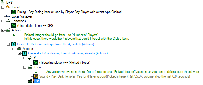
Here is the general layout of the trigger you will use:
- Event: Dialog Item Is Used
- Dialog - Any Dialog Item is used by Player Any Player with event type Clicked
- Condition: Used Dialog Item
- (Used dialog item) == Put the Dialog Item variable that corresponds to the button you want to make the trigger match with
- Actions: Pretty much anything you want to do when the player presses this button. Since we've used "Any Player" in the Event, it is recommended to use a "Pick Each Integer" action along with an If-loop to differentiate the players.
Because a visual of the actions will help much more than a text explanation, here is a screenshot:
Tooltips
When you see a Tooltip value to type in, it's basically the text that will spawn when the mouse hovers the Dialog Item. It can be useful to give additional informations to the players on what the button will trigger.
See Also
- Dialogs
- UI Frames: Provides a description of each UI Frame and gives their respective position so you can easily emulate them with dialogs.
- Custom UI map: an Open Source map that reproduces the system shown as an example in this article.
Video Tutorial
All credits goes to Swampfox, member of StarEdit Network's community. <youtube>vlQR6MXodI0</youtube>
