Difference between revisions of "Making Melee Maps"
m (hotkeys) |
m (1 revision: StarEdit.net Wiki) |
(No difference)
| |
Revision as of 06:16, 21 November 2010
Most people like to play custom games with mods, and while that is fun, those have an entirely different creation aspect to them that don't solely depend on the looks of the map and the ladder-game aspects. But, there are some people who like to create melee maps so they can just play a 1v1 or team game on it, but the problem is that many of these melee map makers tend to focus too much time on the prettiness of their map and their own visual analogy of what they think is "good" rather than the actual perks and requirements that are needed.
Creating a map is not all cake and frosting! Your map may look wonderful and pretty, but if it lacks its credibility and usefulness in its most obvious places, there is no way I (or anyone) would ever play it. Most good map makers will say that they don't even make it look pretty until they are sure people will actually play it. If your map doesn't have the credentials and the worthiness to play, making it look pretty is useless unless you want to practice map terraining.
This is a basic guideline about the things you need to know and keep in mind when you create your melee map. I will not go into detail about the map editor tools and such (although I'll throw the basic principles in there), nor will I go over triggers and data editing, but rather what a map needs and what makes it really worth playing, and overall fun! This guideline is simple and points to the key aspects that you need to pay attention to and work on when creating your map, because once you test it with real people, they will more than likely point these out for you to fix.
1: Layout & Symmetry
- Make your map worth exploring
If you lay out your map in the form of a square, circle, or X, it's too void and boring. It's obvious there is only one way around, and it's obvious where you will meet your enemy. Instead, make your map worth playing by how it is laid out. Make it look fun. Make it look like you want to explore it. Most of all, make it have multiple ways of getting at your opponent. Having one distinct path to each other's bases is too obvious. Instead, add some back ways, short ways, no man's land, and anything else that comes to mind. This forces players to "guess" where his opponent might be, which adds a more variety of strategy and decision-making.
This is how interesting games are made. If you want your whole map to be explored, then have paths that go all over your map, but give players reason to use those paths (such as gold expansions along them). If you plan on making a map, please, first and foremost, make sure the layout is desirable and pleasing to the eye, one that would make the players want to explore a little.
- Key Tip: The main path to get to your enemy should not be small or very narrow, but rather large.
- Give your map Symmetry
Symmetry is incredibly important when creating your melee map. I know you want to be very creative and make something completely distorted and out of proportion, but when it comes to actual RTS players, they prefer maps that have a "mirror effect" to it. What you see on one side is exactly the same on the other side (or at least very similar).
Use this basic example when I am talking about symmetry: O | O
The line is the center, and there are two circles on each side. They are both identical, with the same shape, size, and volume. This is how your melee map(s) should be when you create them. You have the center of your map, and wherever you place your starting locations, be sure to give them each the same amount of room, and most of all, make their portions of the map look the same as the other side! This creates a balance in the aspects of the game when travelling too and from your opponent, and makes scouting less confusing. On top of all that, it's what makes your map look organized and pretty.
2: Choke Points
- Make sure your main/natural choke points are defendable and easy to travel through
Almost every map we play on has the typical main base on high ground with a very small narrow choke point that leads to, or near the natural expansion site. These types of chokes can be defended easily, and any player running his army up that ramp will often have a tougher time producing any good solid results while most likely taking insane casualties. This is why it is a good idea to think about how to make your main choke points interesting.
You can either have no choke point ramp (no high ground), or a rather large ramp to increase the battle worthiness of it (think Scrap Station). When you think about how each race can use a creative choke point accordingly, you have to make sure that whoever is on the attacking side of the choke point is at risk as well. In other words, make sure that if your opponent is at his or your choke point, you have enough room to run the majority of your army through it to be able to defend/attack. (This is something that Zerg players are dying for).
- Key Tip: If you make a ramp, make it big, not small. This gives every race a chance to be effective in their pushes.
3: Expansions
- Make sure your expansions are worth capturing and able to defend
When I say an expansion is "worth capturing" I am talking about the position of it (high ground, island etc) and if it is defendable. On the more important note, you need to have room to build a defense, such as spine crawlers/spores, photon cannons, or turrets and bunkers, otherwise your expansion has very little to no defense at all, and you'd better hope your opponent doesn't find out about it. This makes the expansion out to be utterly worthless unless your opponent is terrible at scouting.
When you create an expansion and you're finished with it, analyze it and imagine yourself building a small base there, and you are being attacked by air. What defense could you use, and where would they be placed to fend them off? Rinse and repeat with the idea of ground forces attacking you. Taking the time to perform these simple things will ensure that the expansion you created will have its value.
- Make sure your expansions are not too close to each other
Unless you are making a 2v2 map or higher, don't put two expansions almost next to each other. There is no point. Whoever grabs one of them is likely to be given the green light and take the other one. Each expansion should be a moderate distance apart to where you can be attacked while moving there. Not all expansions are necessarily free to take, but one must often put the effort into taking the time to travel there.
- Besides the natural, make sure each player has a expansion that is safer than the others
Granted, island expansions are safe and great, but it is a given fact that 99.9% of the time they will either be unused or taken by Terran players, so island expansions are not the best answer when constructing it to be safer than the most simply because Protoss and Zerg do not have a natural inclination and desire to expand to islands. What I mean by safer expansions is: If you have an expansion with two choke points, add destructible rocks at one of the chokes. This gives the player a overall safer mentality, at least for a while longer. This gives the expansion a more "cozy" feeling and can often be defended more easily, thus increasing its value of being used.
4: Minerals
- Make sure your mineral patches are not lined up in a wall formation
This is really important to take into account when you set up your mineral lines. If you line it up like a straight wall, it will not only look unnatural and sloppy, but it creates worker traffic when mining. Your mineral line will appear to look fully saturated very early, and can deceive you into thinking you have too many workers.
Each individual mineral patch can have three workers mining it. That is the definition of a fully saturated mineral patch. If your mineral line is lined up like a wall, only two workers can mine the front of it, forcing the third worker to either 1) run around the entire mineral line to mine the backside of it, and once finished, will have to run back around to the front just to cash it in, or 2) shift back and forth between the line to find a open spot (and with too many workers on a straight mineral line, too many workers will be out of work).
As I said, it is unnatural and sloppy. With that in mind, spread your minerals out a little to give it a more natural feel and allow your workers the freedom to mine and saturate naturally without standing shoulder to shoulder.
- 8 regular mineral patches, 7 regular gold patches (standard number)
These are the standard minimum requirements when placing mineral patches at any expansion including your main base. 8 regular blue patches for a standard mineral line, and 7 gold patches for a gold mineral line.
5: Miscellaneous
- Make sure there is plenty LOS (line-of-sight)
Don't overload your map with trees or cliffs, especially at your choke points. This forces the defendant to run up the choke point just to see what is up there. Open up the space around your choke points, especially at your natural expansions. This is ideal and allows players to build proper defenses with little to no limits, and allows a more flexible defensive setup and strategy.
- Add one or more Xel'Naga Watch Towers
Depending on the size of the map and the its layout, at least ONE Xel'Naga Tower should always be necessary. Because Blizzard implemented such a brilliant idea used for scouting purposes and gathering intel, every player demands watch towers in the maps they play, so be sure to add at least one.
- Key Tip: Place them in the middle of the map, or the middle of the run distance between you and your opponent.
- Foliage
Always add foliage to your map. Nobody likes to stare at plain, boring dirt. To add foliage, go to Layer > Terrain > *tree symbol* (next to cliff and water) > Generate Foliage. Always make sure the density is under 1.00, otherwise your map will look like it's covered with weeds.
- Textures & Doodads
Always add some form of texture to your map, such as grass, small hills, rocks, cracks, etc. Also add some trees if it deems best for the environmental textures. For example, if you're doing a desert or wasteland map, trees probably have no reason to be in there. However, if you are doing a jungle map, be sure to add plenty of trees to give it a jungle feel.
Either way, keep in mind that again, nobody likes to stare at plain, boring dirt.
6: Helpful Tips
- Use a Command Center, Hatchery, or Nexus in the editor
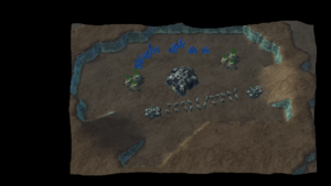
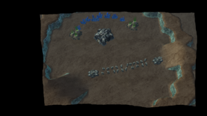
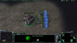
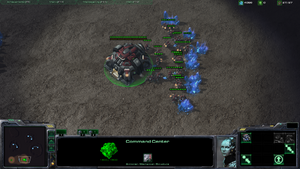
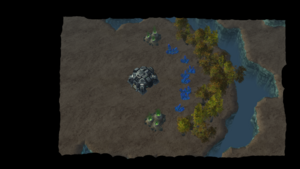
As soon as you pick the dimensions of your map and the textures you want, lay down a command center, nexus, or hatchery (I encourage you to lay down two of them) anywhere on your map. This automatically gives a visual idea of how big the map actually is compared to the starting buildings and helps give you a better idea of how big naturals and main base platforms should be. You can always delete them if you want sooner or later by selecting Layer > Units , then Tools > Selection Mode. Select the main building and hit delete (DEL button).
- Use Game-View and Lock To Game Camera
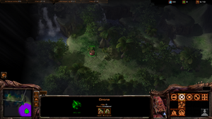
In addition to placing Command Centers etc, you can change the view of your editor to match what it will look like in game
- Press Crlt + Shift + C to lock the Camera to the Game View. So that what you see in Editor, is the same angle and zoom as to what it looks like in Melee.
- Press V to toggle Game View on. This will hide things such as pathing, grid, doodad placement helpers etc. Ultimately, make the editor view identical to the in-game View.
- Using total map view + grid to make your layout better
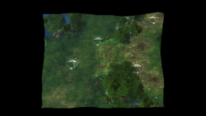
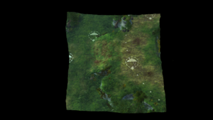
To see what I mean, go to View > View Entire Map. This will give you a birds eye view from straight up rather than at an angle. This will give you a better idea of how to lay out your map. If you plan on making your map just perfect as far as its layout aspects, be sure to enable the grid by selecting View > Show Grid > Large (for overall map design) or Small (for little perks to add in in smaller locations).
Original article created by IronMan. See http://us.battle.net/sc2/en/forum/topic/1020822417 for original article. Reproduced with permission.
