Border-type Images
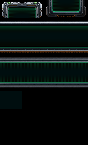
Border-type images are used as the backgrounds of Dialogs or Dialog Buttons. If you change the background image of a Dialog or Button to what seems to be a normal image, you will notice that the image gets cut up. This is because the Dialogs are structured in such a way that it takes all the elements of a frame from a sliced up image.
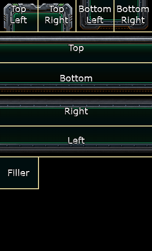
Border-type images are split into 4 columns with an equal width, and 8 rows with an equal height (despite it only looking like we need 6 rows). Using the default Terran Dialog frame below as an example, we see all 4 corners take up the first row, followed by the Top, Bottom, Right, and Left bars underneath it. The "Filler" rectangle on the bottom is the same height and width as the corner sections, but will ultimately get stretched to become the background between all the separate pieces.
The dimensions for the default dialog frames are 300 pixels wide by 496 pixel high, therefore:
- Corner pieces and filler are:
- Width: 75 pixels
- Height: 62 pixels
- Side bars are:
- Width: 300 pixels
- Height: 62 pixels
Theoretically you don't need to follow these guidelines, as long as each section is proportional. For example, if your image was 200 pixels wide and 400 pixels long, then each column would be 50 pixels wide and each row would be 50 pixels high. No matter what, you need to have that 4 column by 8 row layout.

